Along with white, gray is one of those colors that is somewhat tricky. It can be a challenge to find the perfect gray you are looking for. Whether it be a light subtle gray or a dark moody one, there are so many different shades. Gray has so many undertones and can be quite versatile. Gray also creates such a clean, crisp look against white trim. It is pretty much the perfect option if you want to keep things neutral.
So how do you choose the perfect gray?
The best way to choose the gray that is perfect for you is to first get inspiration from pictures. Pinterest and Instagram are two great sources. Keep in mind that pictures may look a little different than in person. Filters and lighting can always change the way a picture looks. It is important to come up with several colors you like then go to your local paint store.
Find the particular grays you have chosen and bring home your samples. After you bring them home, it is important to look at them in the lighting of each room to where they will be going. At this point, you will get a better feel of which gray works best for you.
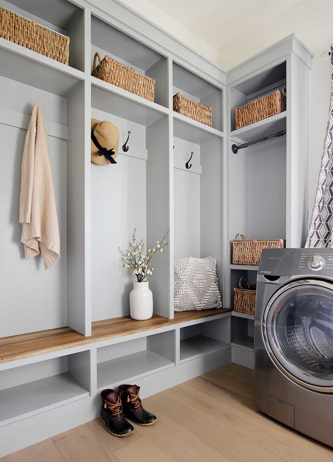
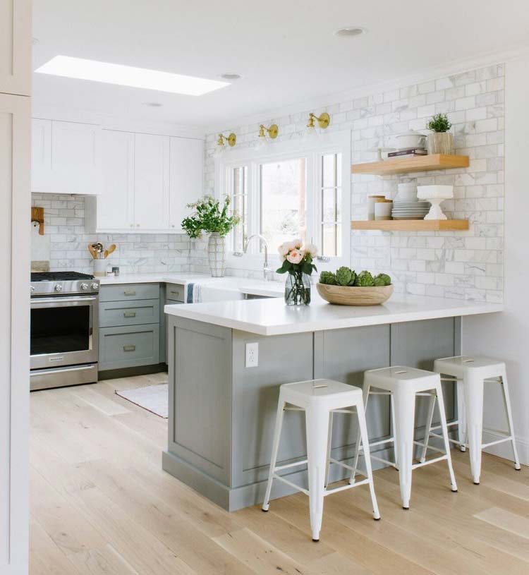
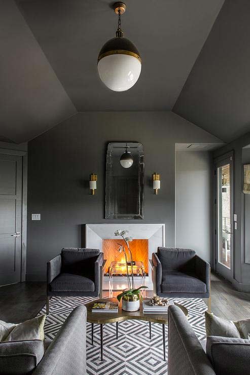
It’s amazing how a color can change depending on the lighting and what other colors are next to it. For example, Dorian Gray on our mudroom lockers and kitchen island looks a bit cooler than it does in different surroundings. This is due to the fact that it is next to the warm wood tones of our flooring.
If you still are a little undecided, ask the paint store to mix you a sample. Coming home to test a couple of colors could save you lots of time and money.
Try On a White Exterior—Without Lifting a Paintbrush
Dreaming of a fresh white exterior but nervous about taking the plunge? With CurbAppeal.ai, you don’t have to imagine it—you can see it. Simply upload a photo of your home and type in a prompt like “Paint the siding white.” In just seconds, you’ll get a realistic rendering of your home in a crisp, clean white. It’s the easiest way to explore that timeless white look (or test a few shades!) before you ever commit to a can of paint.
Our Favorite Paint Sprayer
Our favorite paint sprayer, hands down, is the Magnum X7 Cart Airless Paint Sprayer. This tool is a game-changer for anyone tackling large painting projects. What makes it stand out is its ability to deliver a flawless finish with incredible efficiency. Whether you’re painting walls, ceilings, or even exterior surfaces, the Magnum X7’s powerful motor and adjustable pressure control allow for precise application, reducing overspray and saving on paint.
The added mobility of the cart design makes it easy to move around, ensuring you can cover every inch of your space with ease. It’s perfect for both DIY enthusiasts and seasoned professionals, making every project feel less like a chore and more like a creative endeavor.
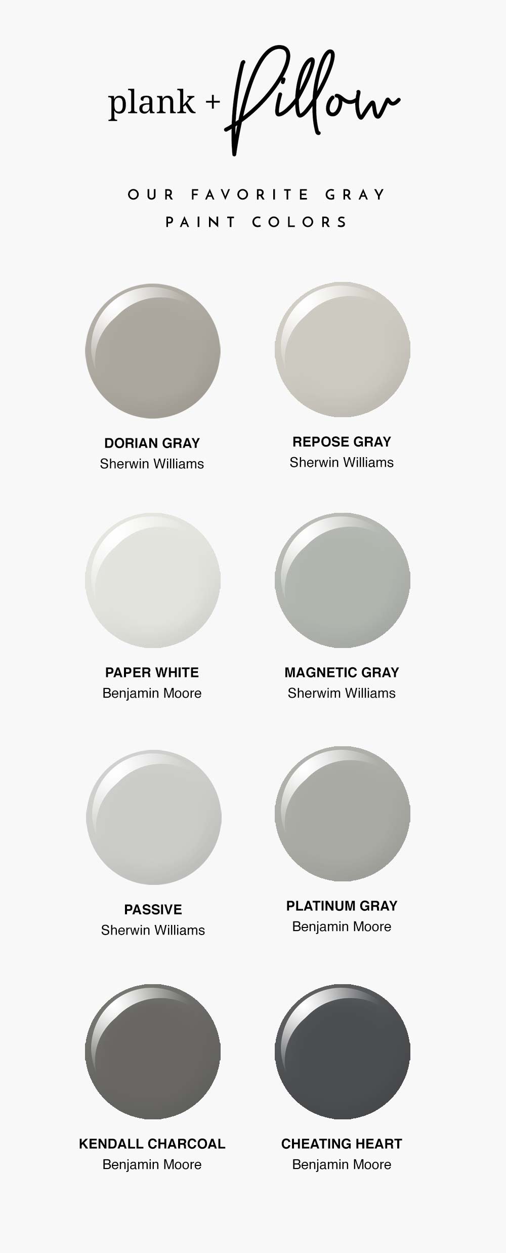
Here are a few of our favorite grays. Hope they will be an inspiration and help to you.
Sherwin Williams Dorian Gray
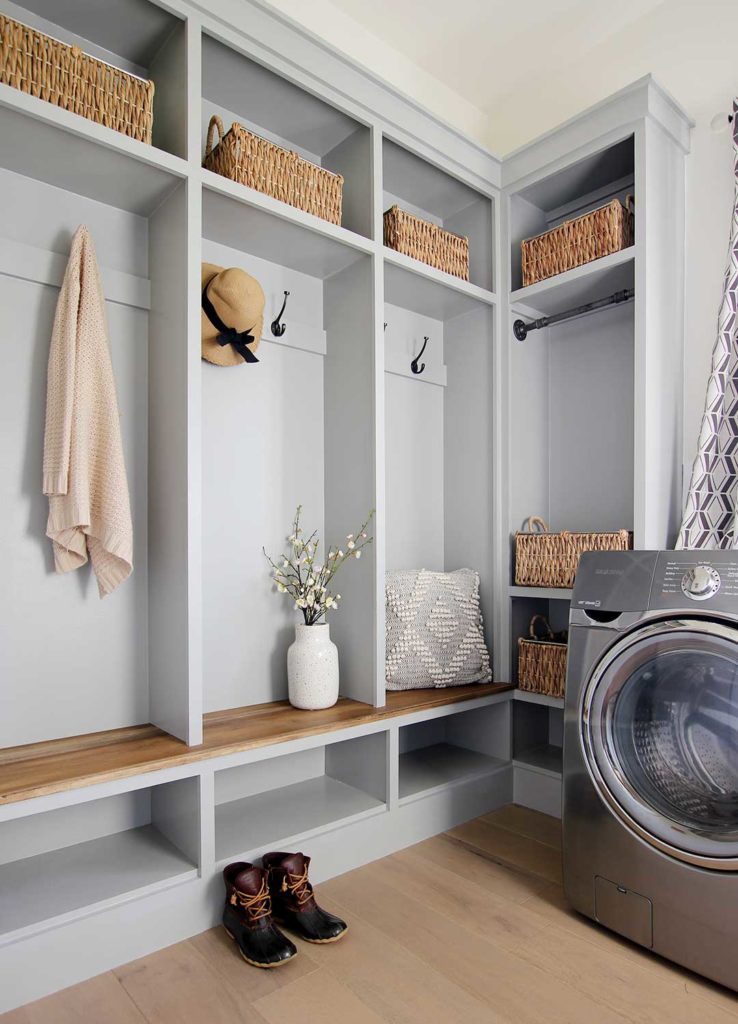
Dorian Gray by Sherwin Williams is one of our favorites. We used this color on our current farmhouse kitchen island and our mudroom built-ins. It is a medium-toned paint color with greige undertones. To us, it had the perfect mix of a lighter gray with just a little warmth.
Sherwin Williams Repose Gray
Repose Gray by Sherwin Williams is very versatile and could work wonderfully in pretty much any room. It is on the warmer side of the gray palette. Repose Gray looks so good paired with white trim and hardwood flooring.
Benjamin Moore Paper White
Despite its name, Paper White by Benjamin Moore is a soft light gray. If you’re looking for a gray for your walls that won’t prevent your room from feeling light and airy, this is a good choice. And it is dark enough to still create some subtle contrast between the walls and your white trim.
Sherwin Williams Magnetic Gray
Magnetic Gray by Sherwin Williams is very soothing and peaceful. It is a muted blue-green-gray paint color. Magnetic Gray is a little dark and would work best in a room with lots of natural light.
Sherwin Williams Passive
Passive by Sherwin Williams is a refreshing light gray paint with cool undertones. This is such a light gray it can easily be used and even works best in darker rooms. If you are looking for a very subtle gray that is almost white, this is the perfect one for you.
Benjamin Moore Platinum Gray
Platinum Gray by Benjamin Moore is considered a mid-tone gray. It is included in Benjamin Moores’ most popular Historic Color collection. Although considered a more traditional gray, Platinum Gray could also work very well with a more contemporary space.
Benjamin Moore Kendall Charcoal
Kendall Charcoal by Benjamin Moore is on the darker side of the gray color palette. It is a very deep, luxurious gray that works great when used with white trim. This color would be great for a moody office!
Benjamin Moore Cheating Heart

Cheating Heart by Benjamin Moore is another gray on the darker side. It is a very timeless, elegant, classic gray. Cheating Heart is more of a charcoal gray color with a touch of navy. It’s very commonly used in kitchens and baths. I could see this being a beautiful kitchen or bath cabinetry color.

5 Comments
We have Repose Gray, Dorian Gray, and Passive in our house and I love them! Just the right mixture of warms and cools. Great article!
August 8, 2019 at 7:17 pmThanks! Those are all very good choices. 🙂
August 13, 2019 at 6:37 pmI just love Collingwood Gray by Benjamin Moore. Great for open concept homes where a light gray with a bit of punch and warmth is desired. I have my kitchen and hall painted with this and never get tired of it. It has no obvious undertones of purple or green. Blends beautifully with Thunder by Benjamin Moore which I have in my living area. Thunder is a warm, slightly deeper gray. To me both of these are perfect grays,
January 25, 2020 at 9:45 pmHello Tania!
January 27, 2020 at 1:40 pmYes, I agree both are so beautiful and perfect!
i am painting my basement in cheating heart, and doing a board and batten around the whole room what color should i do the top when my trim is swiss coffee?
November 2, 2020 at 12:22 pm