

Some parts of designing a house are easy to picture. Others take a little more work. You can like a cabinet color, a countertop, and a wood finish individually, but seeing how they might look together in a room is a different thing.
That was where ArchRender came into the process for the scullery in our new house. You’ll see that it performs just as well with interior renderings as it does with exterior ones. We started with a screenshot of our Revit model and used it to create a more realistic visualization of the space. It gave us a way to look at the room as a whole before carrying the design into real life.
If you followed our custom floor plan reveal, you may remember that we placed the back porch off the scullery and pantry. This little area is part of how the house connects to the outdoors, so there is more to think about than cabinetry alone.
Starting With a Screenshot From Revit
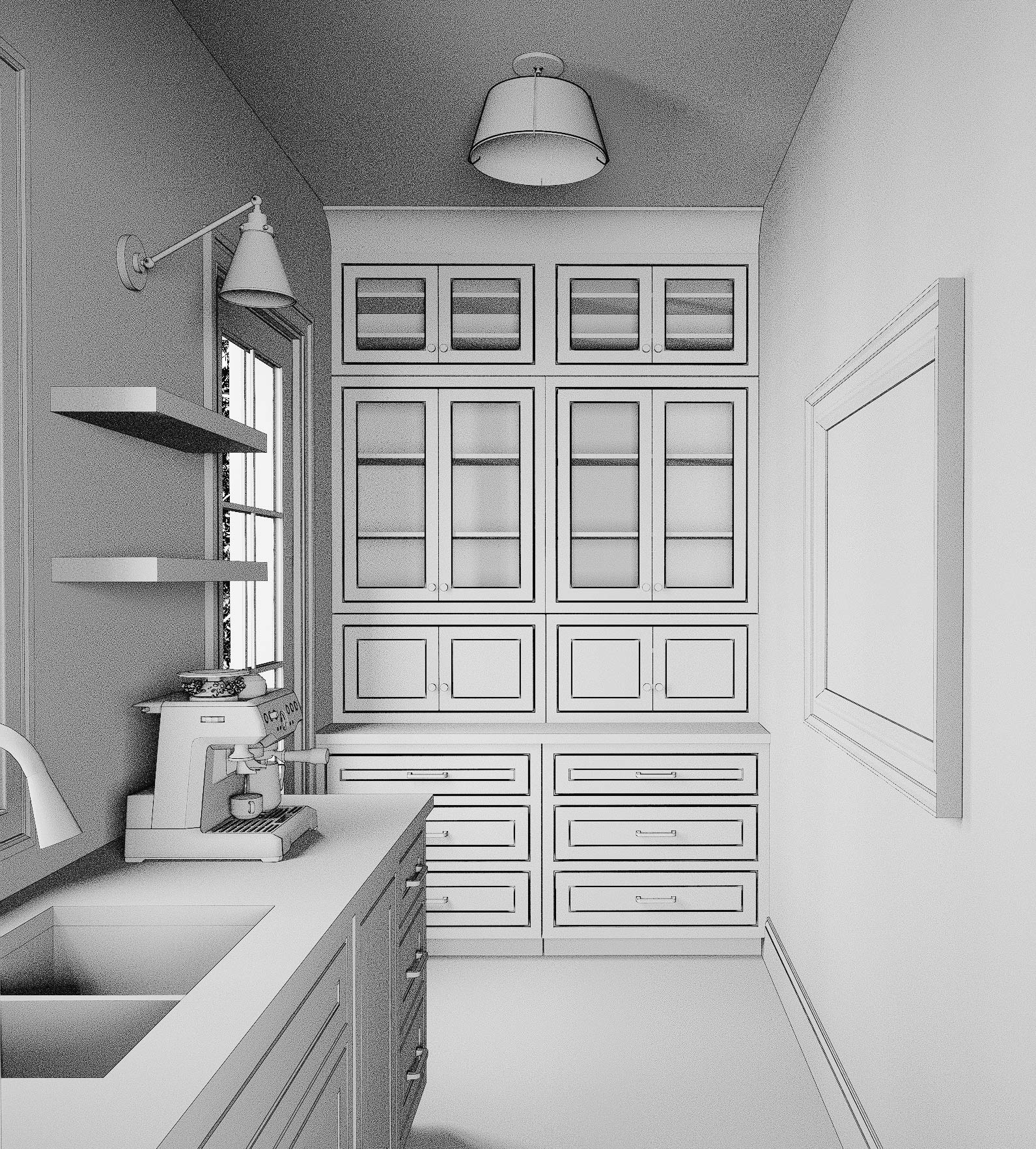
The starting point was our own Revit model. Having a view of the actual room gave the visualization a connection to the house we were designing. Instead of trying to imagine our scullery from a collection of inspiration photos, we could begin with the space itself.
A model and a finished-looking image answer different questions. The model helps show the arrangement of the room. A render makes it easier to read the finishes together and imagine the feeling of standing there. For this part of the process, that was what we wanted to see.
Taking the View Into ArchRender
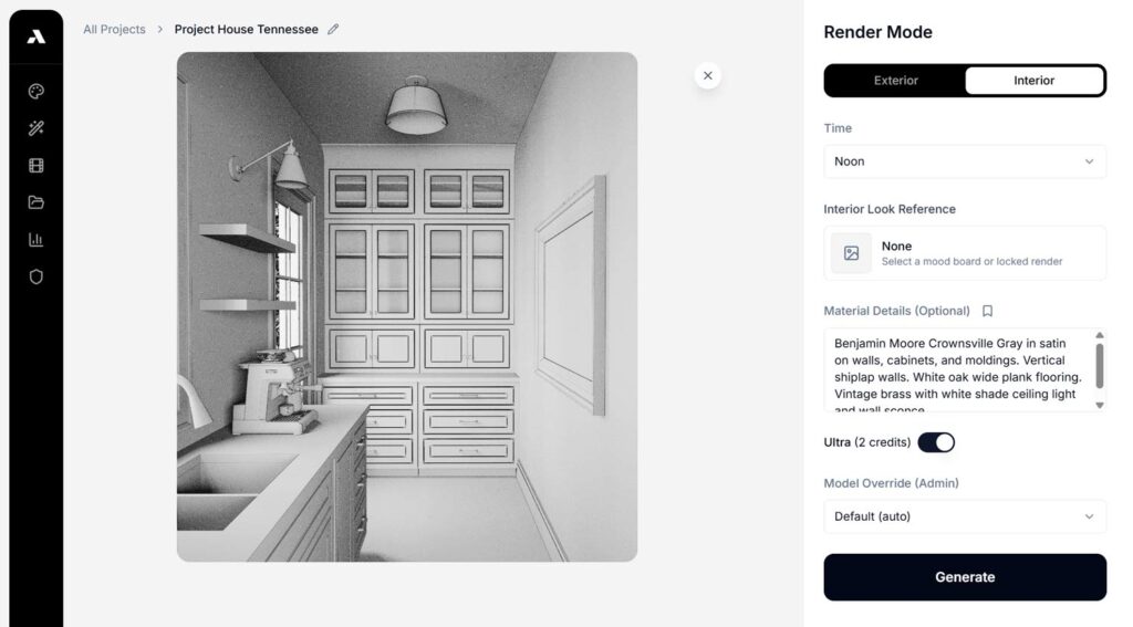
From there, we brought the Revit screenshot into ArchRender and used a prompt and settings to guide the visualization. This is the part of the process where the starting view becomes an image with more of the color, texture, and atmosphere of an interior.
The original screenshot, prompt, and settings belong together when sharing this step. Seeing all three will make it easier to follow how we got from the model to the render below, rather than just seeing the result on its own.
prompt: “Benjamin Moore Crownsville Gray in satin on walls, cabinets, and moldings. Vertical shiplap walls. Soapstone countertops. Antique brass hardware. White oak wide plank flooring. Antique brass with white shade ceiling light and wall sconce. White dishes in cabinets.”
Seeing the Scullery Come Together
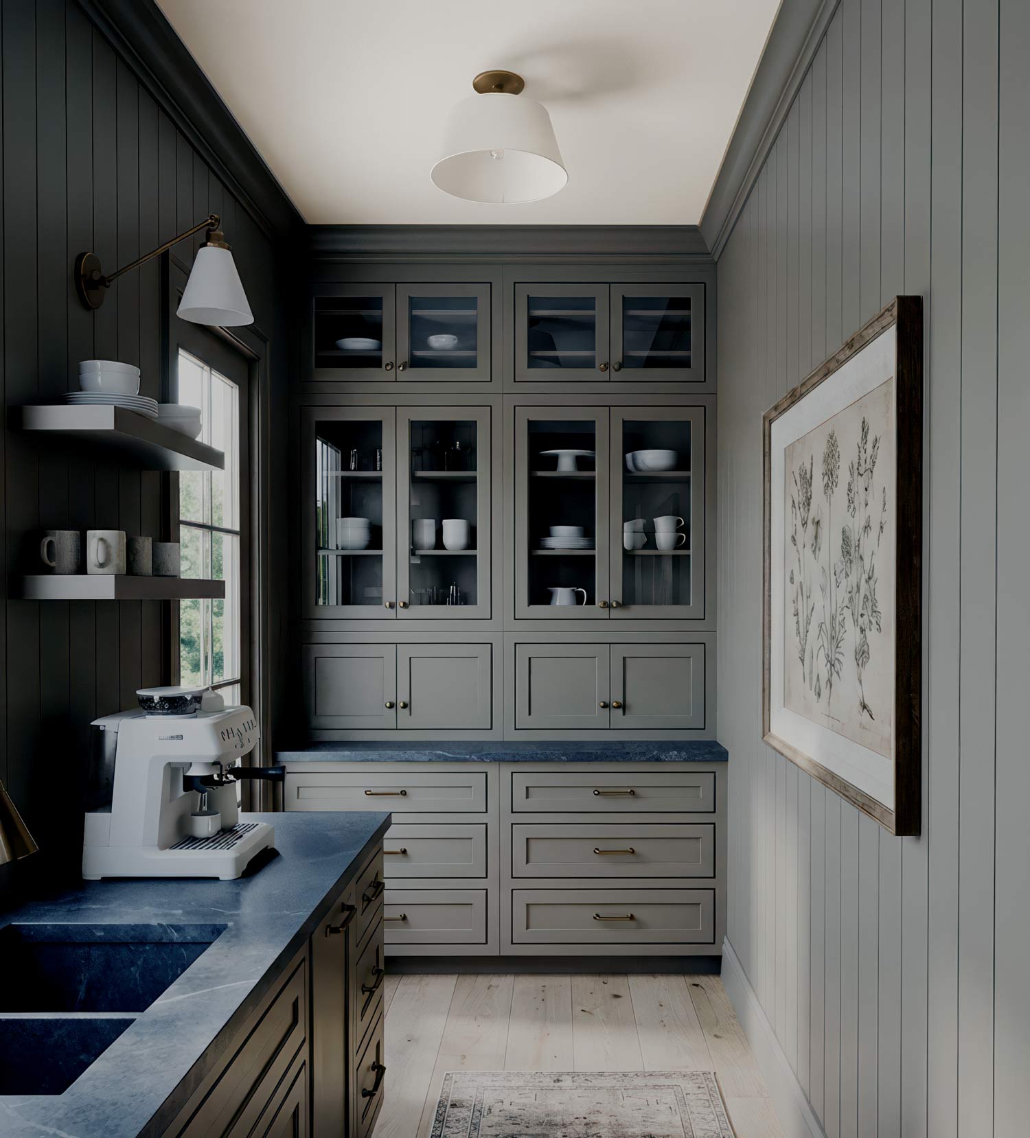
The color we chose is Benjamin Moore Crownsville Gray. In this first render, it reads as a muted olive-taupe across the cabinetry and vertical paneling. The dark counters create contrast, while the light wood floor and white dishes break up the deeper tones. The glass-front cabinets give the back wall detail without making it read as one solid surface.
What makes this view useful is being able to see those elements at the same time. A dark countertop takes on a different role when you can see it beside the cabinet color, the floor, and the light coming through the window. The brass-toned details are small, but you can see how they fit into the overall palette.
Seeing Crownsville Gray alongside the other finishes helped us assess the overall palette. The countertop material and other product details will be added with our confirmed selections.
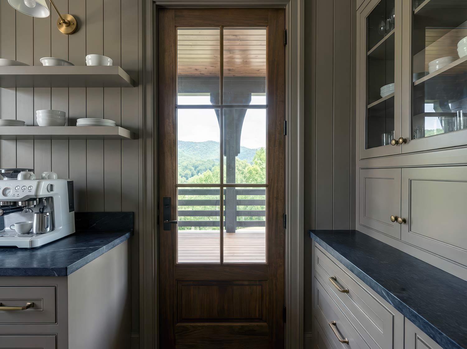
The second view brings the exterior door into the picture. Here, you can see the wood tone of the door alongside the painted cabinetry and shelving. It also shows how much of the view is taken up by glass and the connection to the porch beyond.
Looking at both angles gives a fuller sense of the room. One draws your eye toward the cabinets; the other draws it toward the door. Together, they make it easier to consider whether the finishes feel connected throughout the space.
Using the Renders to Make Design Decisions
For us, the value of this step was seeing the finishes together. It is easier to assess a combination when you can look at it in the context of the room instead of holding each choice separately in your mind.
Does the palette feel balanced? Is there enough contrast between the cabinets and counters? How does the wood tone relate to the painted surfaces? These are the kinds of questions a visualization helps bring into focus.
Making Changes with Edit Mode
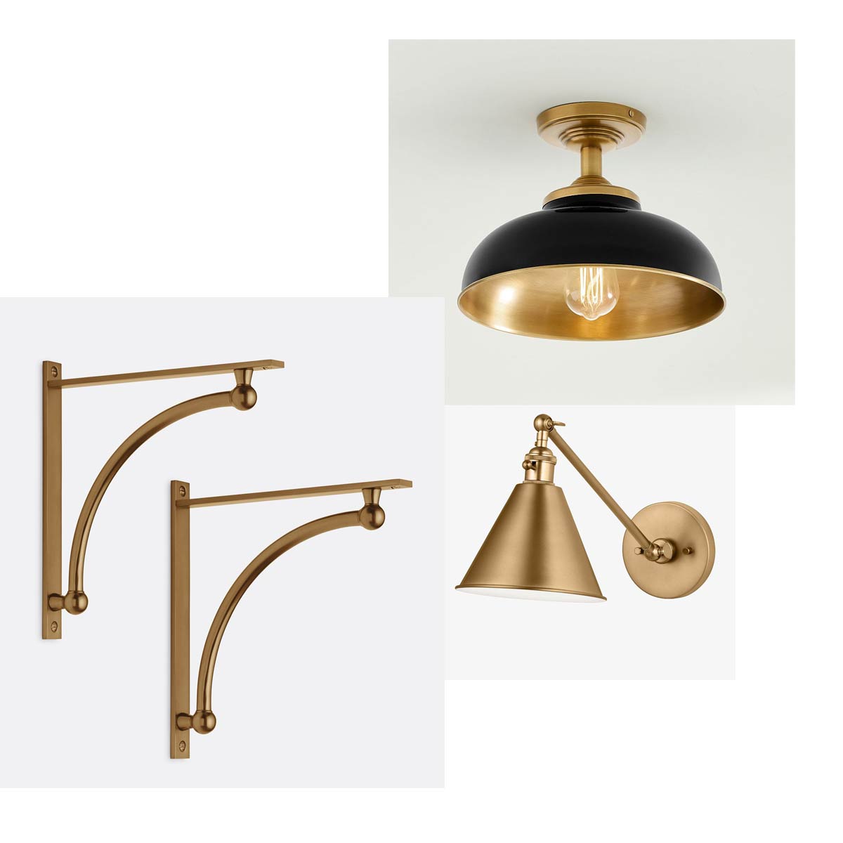
Once we decided on few items in the scullery like the lighting and open shelving hardware, we added those items to a mood board and using ArchRender’s edit mode plus the mood board option, we inserted those items into a new render as well as making some addtional changes to the room like the cabinet hardware, reeded drawer fronts and painted ceiling.
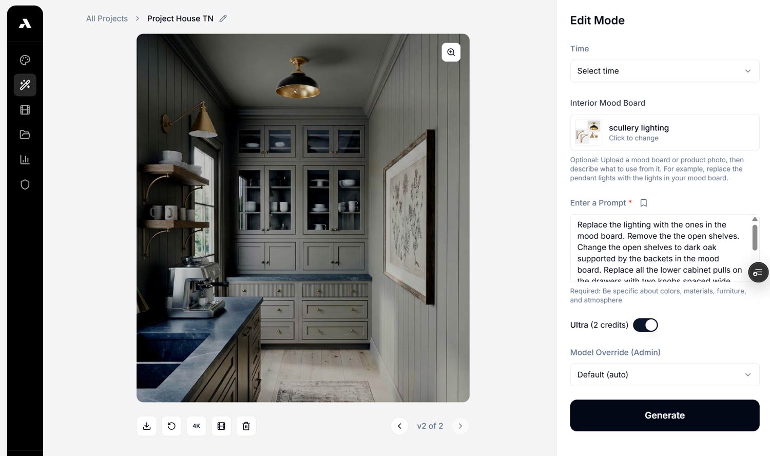
prompt: “Replace the lighting with the ones in the mood board. Remove the the open shelves. Change the open shelves to dark oak supported by the backets in the mood board. Replace all the lower cabinet pulls on the drawers with two knobs spaced wide. Change the espresso machine to silver. Change the two top drawers only to reeded and the same color. Paint the ceiling the same color as the walls.”
Bringing the Design Into the House
The next part of the story is taking the design from the screen into the house. This is where the actual selections and installation details give the render something real to be compared against.
The render helped us confirm that our vision was going to look amazing, but we did make some changes. We ended painting the ceiling the same color as the wall an cabinet. We also chose different lighting and going with a different look for the open shelves, going with knobs instead of pulls and adding a reeded detail to the top drawers.
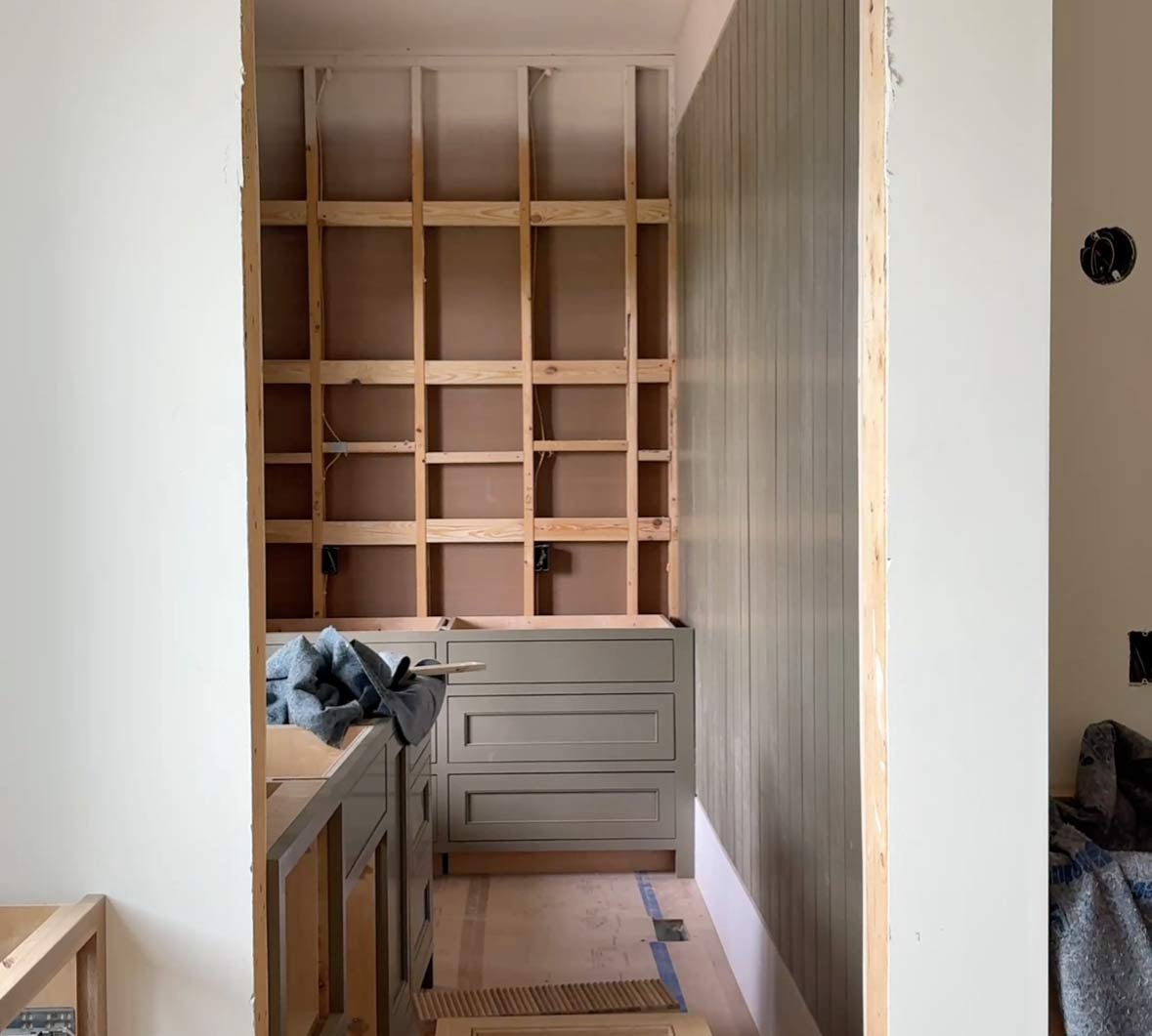
Comparing the Render With the Finished Room
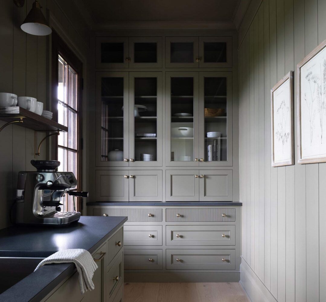
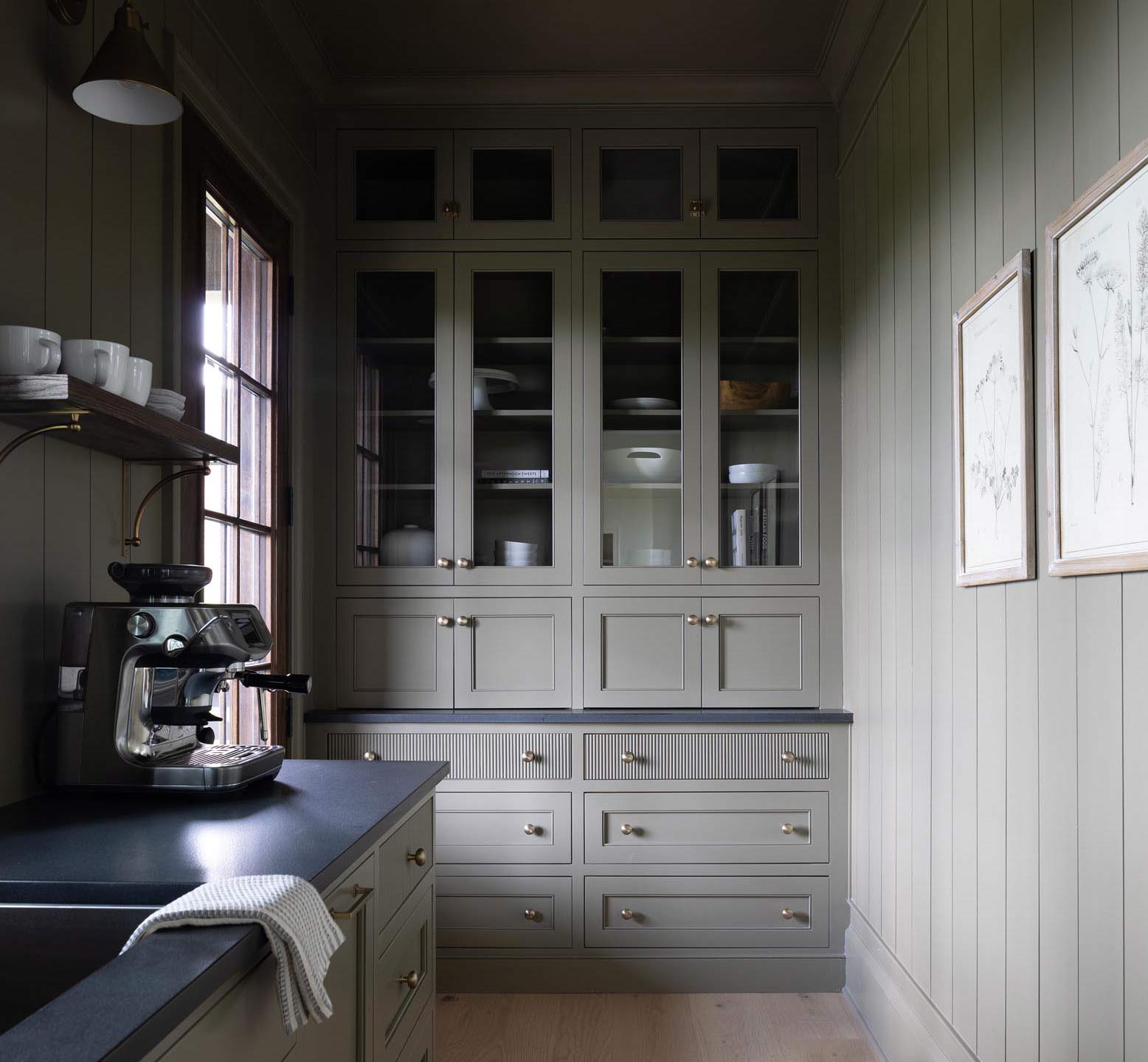
And here is a photograph of our finished scullery!
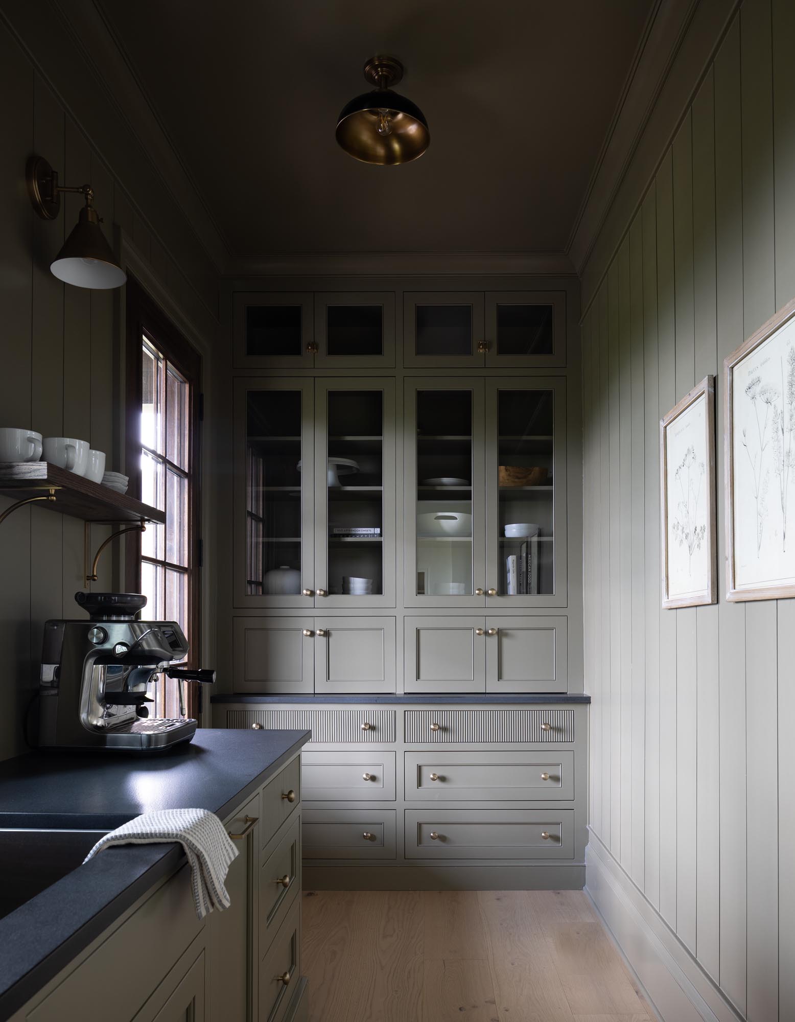
The main elements are easy to recognize comparing the photo of the actual room to the render: the glass-front cabinetry at the end of the room, the vertical paneling, the dark counters, and the light wood floor. In the photograph, Crownsville Gray reads deeper than it does in the render, although the lighting and exposure also affect how the color appears.
But you can also see what’s different and the design changes we made. The finished room has a dark ceiling fixture in place of the render’s white shade, a wood shelf with visible brackets, reeded drawer fronts, and two framed botanical prints on the right wall. For the countertops, we opted for black granite instead of the soapstone that we visualized with ArchRender. All of these details give the actual room its own character while the overall palette remains closely connected to the visualization.


No Comments